How to avoid the pixel gap

I build meaningful software by empathising with design, development and business needs. My interests are test automation, functional programming and full-stack web development using NodeJS and other tools.
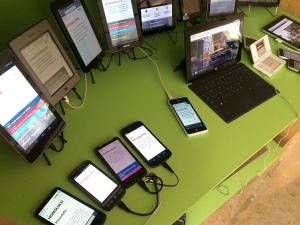
Mobile, tablet, phablet, netbook, notebook, e-Book reader, touch-screen-thingy, wearable, clickable, smart tv – how do we create layouts for so many platforms and keep our sanity?
Modern cross-platform development
TLDR;
More screen sizes means more effort to build creative content which can cause unsupported or future devices fall through the pixel gap – screen sizes not considered in our pixel perfect designs. In response, we can use totally fluid layouts based on the device font size, scalable vector graphics, image proportions and art direction to close the pixel gap.
Red flag
As steam powered coaches, which we would now recognize as a primitive cars, were being adopted in the UK in the 1830s, the Locomotive Act of 1865 required that 3 drivers man a car – 2 to sit inside while the 3rd walked in front with a red flag to warn others of the on coming vehicle. This law was not repealed for 31 years. It sounds funny now because of our familiarity with cars. We understand that someone walking in front of a car limits its purpose by restraining it to a walking pace when it could go much further and faster. Yet we do the same thing to our digital presence on the web by limiting them to pixels which have become a less accurate way to describe our creative intent.
we experience the world in an infinite range of pixels that our devices are catching-up with and so our designs must follow.
In 2016, the much anticipated Oculus Rift virtual reality headset will enter the consumer market, how many pixels would we use to design for this platform? The question hardly makes any sense because we intuitively know that we experience the world in an infinite range of pixels that our devices are catching-up with and so our designs must follow. How wide is the viewport? Might be a better question.
Mind the gap
Apple succeeded in their quest for sharper images on their devices by increasing the number of pixels contained in a physical area on a screen and other manufacturers followed. At the moment we have 2 and 3 times the number of pixels per inch on Apple devices and up to 4 times on Android. But these are not fixed points on a scale but graduations along a spectrum and we depend on the platforms our users have to manage these variations – to fill in these pixel gaps. What that means on a 2x screen is a 100px by 100px image will be shown in a 200px by 200px area which may cause it to look blurred.
Google’s guide for Android developers to support multiple screens suggests describing their application layouts using “density-independent pixels” (dp). Using a baseline of 160 dots per inch (a.k.a. pixels per inch) we can compare different Android screen sizes using a formula
density-independent pixels * (dots per inch / 160) = pixels
and this is the main point, the design is described independently of the platform.
Although pixels are used to physically draw on the screen of any particular device this can handled by the platform because, and this is the main point, the design is described independently of the platform. There are exceptions to every rule and situations where we would like to manage the details but we benefit from the generalisation in time and effort and our users have an experience appropriate for their device.
Layout
For the web, Basing our designs on the base font size (known as “em”s) will allow our layouts to become resolution independent. On most browsers 1em is about 16px. Using this font size we can then derive the length of a readable line of text and so begin to build columns for our layout. Instead of saying “This is a 960px layout” we can say, “This layout is one paragraph wide” with multi-column layouts being possible too i.e. “Each column is 1/8th a paragraph”. Plus, our users can increase the size of their font without breaking our designs. This brings Responsive Web Design to its full maturity by embracing devices and screen types we cannot anticipate. This has been called the Goldilocks approach – we all get to enjoy our porridge at our preferred temperature.
Images
Where we can we should use Scalable Vector Graphics (SVG) which can scale without loss of clarity. For everything else, using aspect ratios can help us think of our images more closely inline with how they will be displayed.
In a responsive design only the width of the image is set relative to the layout. As the screen size grows or shrinks, so does the image’s width while maintaining its proportions. So, instead of saying, “This image is 1200px by 600px” we can say, “This image is 2 by 1”. We can work from high resolution images e.g. 3600px by 1800px (x3 resolution) and scale them as needed to 2400px by 1200px (x2 resolution), 1200px by 600px (x1) or 600px by 300px e.t.c. Here are some common aspect ratios we might already be familiar with – 1:1, 2:1, 4:3, 16:9.
Some images, though, lose their impact as they are reduced in size and we can use some art direction to handle these exceptions especially at the mobile view and portrait orientation.
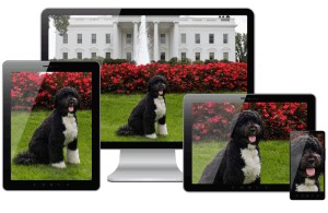
Combining art direction with scaling responsive images
Conclusion
There are tools and tutorials available for both developers and designers to embrace this approach to that allows us to serve our users better.
In a completely fluid layout paradigm, a pixel perfect design can find its place by it expressing the idea that, “This is how this design will look on a particular device with these attributes but experiences may vary” which brings honesty and pragmatism to the conversation while confronting the uncertainty of an ever evolving digital landscape.
Next steps
What size is this font? Determining font size for the web from Photoshop, InDesign et al.
Bibliography
- Density conversion chart
- Phone, tablet and desktop screen sizes
- T+L Density Converter
- iPhone 6 Plus resolution confusion: Xcode or Apple’s website? for development
- Getting Started – Chartist.js
- Multi-resolution apps for Windows Phone 8.aspx)
- Google Android developer pixel perfect recommendations
- 8 Charts on Interesting Internet Trends (According to Mary Meeker)
- Confused about REM and EM?